Friday, February 13, 2015

Living Room


Since we haven't posted in a while, I wanted to share our living room over the holidays.

We only did a little work in the living room, but it had a huge impact. We didn't care for the popcorn ceiling, and since it was too hard to remove it, we covered it with 1/4" drywall. We painted all walls and ceiling in white (Sherwin Williams Pure White 7005). We liked the built-ins around the fireplace, but the natural wood and the fireplace tile color were blending in too much with the walls, so we selected a dark color (dark navy blue) to paint the fireplace wall and the ones behind the shelves.

BEFORE

After, during the holidays.

Master Bath 2

One of my favorite parts of the renovation, is when I can do a little shopping.

If you like clean, modern design,  I recommend selecting a tile that will emphasize your style and not clutter your bathroom: choose a bright light tile, with a simple design (very simple) and large rectangular shapes. If you do want a little "glitz" in your bathroom, use it for details. We created a niche to hold our toiletries and used a mosaic tile with silver, grey and green accents. For the tile edges, we ALWAYS specify aluminum Schluter trims, so it was no surprise that we installed them in our shower as well. These trims keep the edge sleek and clean. As for the tile layout, I don't leave anything to be "worked out" in field. I arranged the tile on the adjacent room floor and let "strict" instruction on how to be layout out.

When we were deciding on the shower pan, we knew there were two options: prefab acrylic pan or built up a tile shower pan. In my experience, I know that if your tile installer is not the best, chances are the tile shower pan will eventually leak. Well, since we (and by "we" I mean Tony and his friend) were installing the tile, I decided to select a prefab acrylic shower pan. We specified and used  Dreamline products before in our projects, and I admired their quality, their simplicity and the low profile ( only 2" tall vs. a min 4-5" for a tile shower pan).

There are not enough great things I can say about the Hansgrohe bathroom fixtures, and I recommend them to everybody: German products made to last. I selected the Raindance 6" shower head, Pressure balance trim and the Ibox Valve.

selecting the main tile
my layout
Schluter aluminum trim and a detail of our accent tile
Dreamline Shower Pan

Hansgrohe Shower Fixtures

 Links for products we used:
http://www.bathauthority.com/low-profile-single-threshold-shower-tray.html
http://www.hansgrohe-usa.com/articledetail-raindance-raindance-s-150-air-green-1-jet-showerhead,-2.0-gpm-04342000.html?fsid=0x00000033000074C9&pageid=e8715959-54d2-4025-9e39-5ebe29c5854b&q=

Master Shower 1

When we purchased our home, I liked the Master Bath because it was large and bright, but I never liked the bathtub. I don't like bathtubs in general, we are more "shower people".

We decided the bathtub had to go, and we wanted to create a spa-like shower,  a large bright, open shower we can share (wink, wink).

First phase: demolish existing bathtub and bathtub surround. Tony did most of the demolition by himself with some help from our friends.

Before

First, Lenka removed the glass shower doors


Then we removed the acrylic wall panels.


Tony prepped the floor for the shower pan.

New shower drain installed (by a professional)
New shower valve.


Improvising

We are so sorry for not sharing more on the blog lately but a lot of things happened, good things, beautiful holidays in the new house and, on top of everything, we are both so busy at work. It seems everybody decided to renovate or built a house :) (not complaining).

The house renovation is "almost" complete. We've been living here since the lasts weekend in november and we love it as much as we did at the beginning. This is the perfect house for us. We will try to share more with you in the coming weeks :)

Bellow a funny picture during the renovation phase: The Engineer improvising: using the vacuum attachment to pour water in a bucket to prepare cement for the shower base.


Monday, November 10, 2014

Insulation :)

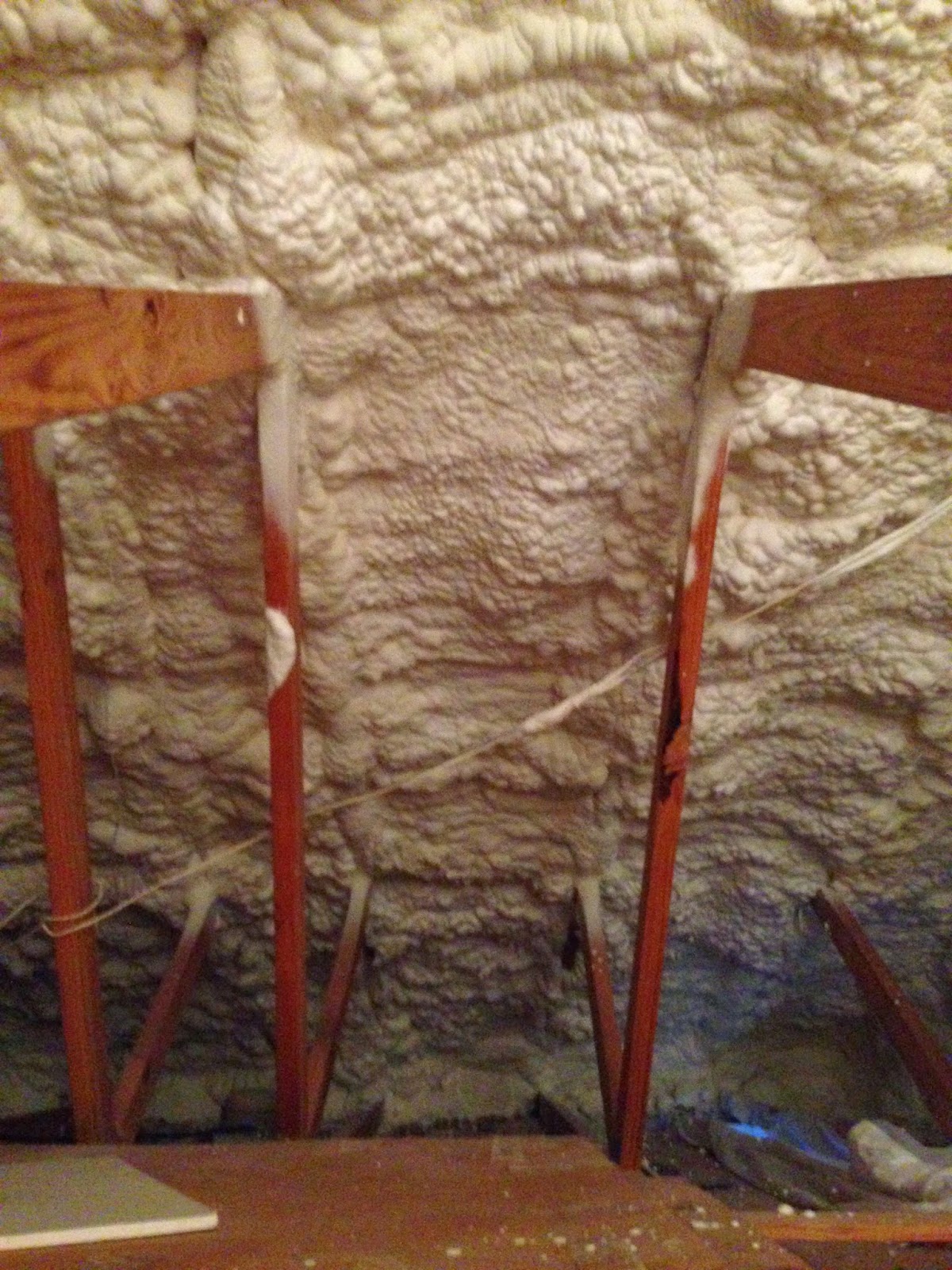
When purchasing or building a home a lot of people don't pay attention to one of the most important things: insulation. If we don't see it, it doesn't mean that it's not important. After inspecting our home, we noticed the roof insulation was very thin and in bad shape. Also, our HVAC unit was located in the attic, above the insulation, which means that we were cooling and heating outside air. This is very bad for your power / gas bill. The HVAC unit should ALWAYS be located in a conditioned space.

On all the homes we design, we always specify to use spray foam insulation between the roof rafters. The spray foam not only provides the R-Value required by Code but also seals any gap and/or opening where air might infiltrate.

There are a few companies in Atlanta that install spray foam in your attic: they vacuum your existing insulation (with all the debris), disinfect the attic and spray a minimum 6" of foam to the underside of the roof decking.

See below our attic.


Kitchen / Dining Room

The wall between the kitchen and the dining made both rooms to feel small and dark. The pocket door was not sufficient to connect the (2) rooms together.

We demolished the existing wall and created a larger kitchen/dining room. 

When removing existing walls, it is VERY important to consult a professional!!! Luckily for us, Tony is a junior structural engineer and I've been working on existing older home renovations for the last 7 years, which allows me to evaluate and calculate existing and new necessary structure. 

Unfortunately, since no renovation goes on smoothly, when we removed the kitchen/ dining wall we discovered there were two existing (3) 2x 10 built-up beams resting on the wall top plate about 2' from the west wall. There wasn't even a built- up post to support these beams. Fortunately, right below the beams, in the floor structure, there was a 6x 10 beam spanning all the way to the north exterior wall. We calculated, and the 6x 10 beam and a new 4x4 post was sufficient to support the (2) built-up beams and carry the load from the built-up beam to the to the beam below.

See below a few images before the demolition, during, the new post and the almost complete opening.


BEFORE - View from the dining towards the kitchen

BEFORE - View from the kitchen towards the dining room

DURING

DURING


DURING -  View from the dining room towards the kitchen

DURING - Post installed

Post top
Post base


Closet 3

A few weeks ago I explained our solution to obtain a larger master walk-in closet: http://anarchitectandanengineerbuyahouse.blogspot.com/2014/10/closet-2.html


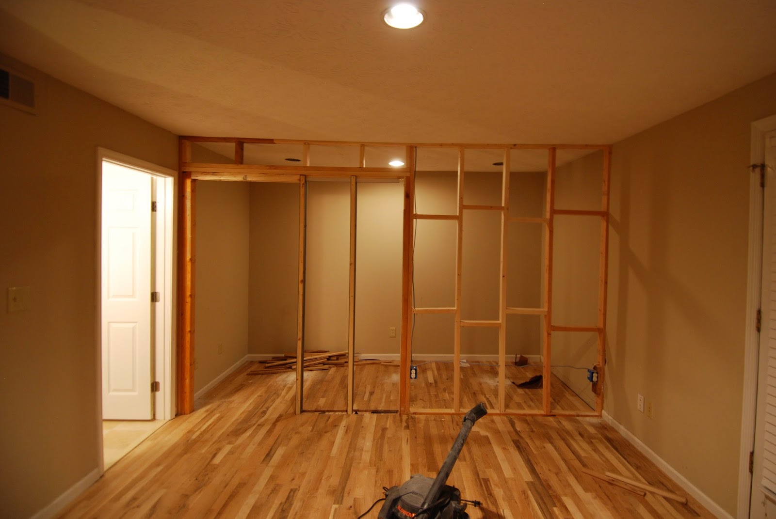
The sheetrock and floor are now complete: please see below a couple of images with the framed pocket door and the finished closet.

Pocket door into the closet

View in the closet